Monday, May 26, 2008

Student's example: Research website 2

Name of Website: Hood-Skillz
URL of Website:
http://www.hood-skillz.com/


Evaluation
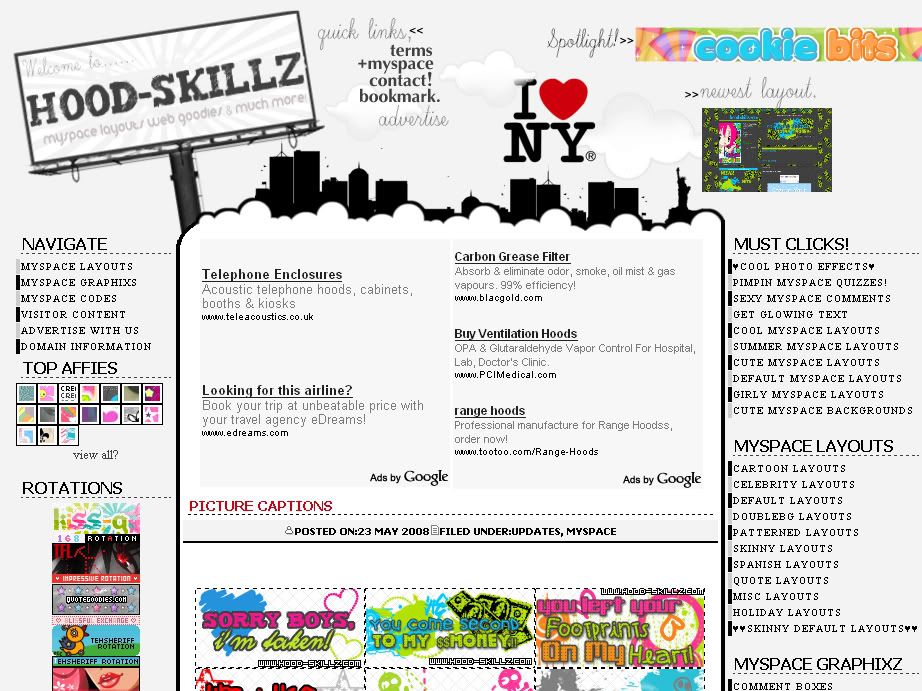
This website has a creative layout, which is very eye-catching. I like the use of image maps at the top to make the links blend in well with the background. The text bars are trendy and attractive while the mini thumbnails are adorable and makes the site less wordy.
The website also have a nice colour scheme of grayscale plus red throughout. However, the links above are a bit unorganised, making the layout have a 'busy' look. Colours of different buttons around the site clashes. Also, the text for the content are a little too small.
The domain name is unrelated but it includes the necessary information in the title of the web browser and the content are relevant.

How does this apply to your website?
This website inspires me to create an interesting layout rather than the usual table (rectangular) styles. I must ensure colours in the layout to remain consistent throughout and avoiding placing images all over with different colours. I would also take note of my font coordination with the background. Organization is needed to make the website look neater and less wordy.

Rating (1-10)
7/10

Student's example: Research - website 1

Name of Website: Bleach Portal
URL of Website: http://bleachportal.net/


Evaluation
This website has a very neat layout. It is easy to navigate as the main links are all to the left, while latest news just above the content. Useful links (front page, donate and forum) are also easy to access as they are place on top.
The colour scheme is well chosen, which matches the header and images. The fonts are standard size and the download links stood out with an arrow on it's left as a bullet point, it's colour and dotted underlines.
The content is straightforward and the importance of the information on each post is varied with the colours (Post title - Huge large orange text, Episode titles - bolding etc) . There are no colours that are out of place (like random addition of pink, green etc), the website stick to the main usage of blue, white, orange and black.

How does this apply to your website?
This website helps me to make sure my website would be well organised and choose the right colour scheme.
Best is to have the text and images matching the colours of the whole layout, it would also give the website a more 'tidy' look.
Furthermore, it's important to place the links at appropriate places for easy access, like how the links are organised there.
Use of correct font size and varying the colours would help to enhance the readability of contents and highlight the necessary information.

Rating (1-10)
9/10